
Entain
Summary
Mission
Entain operates over 30 global brands, each with its own teams, tools, and ways of working. While this allowed flexibility at a local level, it also led to inconsistency across products and made it difficult to scale design effectively. The goal of this project was to bring structure to that complexity by creating a unified design system and improving how teams worked together. This wasn’t just about visual consistency, but about creating a shared way of designing, documenting, and delivering products across the organisation.
My Contributions
As Lead Designer, I played a key role in shaping both the design system and the platform that supported it. I worked closely with service designers, engineers, and stakeholders to understand how teams operated and where things were breaking down. From there, I helped define how components should be structured, maintained, and used, while also designing the platform experience that brought everything together.
My focus was on turning a fragmented way of working into something clearer and more usable, making sure the system could support how teams design and build products in practice.
Dashboard + Training Screens
Understanding the Challenge
Discovery
We spoke to teams across different markets to understand how the existing design system was being used. While a system technically existed, it wasn’t widely adopted. Teams were often creating their own components or adapting existing ones, which led to inconsistencies across brands. There was also a disconnect between design and engineering, making it difficult to maintain or evolve components over time. It became clear that the issue wasn’t just the system itself, but how it fit into the wider organisation.
Mapping the Current State
We mapped the design system as a service, looking at how components were created, updated, and used across teams. This exposed gaps in ownership, unclear request processes, and limited visibility across teams. As a result, people often worked around the system instead of relying on it. Creating this shared view of the current state made it easier to align on what needed to change.
Where to Focus
With a clearer picture in place, we focused on the areas that would have the biggest impact. This included improving how components were documented, simplifying how teams request and manage changes, and creating clearer workflows between design and engineering. We also needed a platform that could support multiple brands without breaking the underlying system. These priorities gave us a clear direction for the work moving forward.
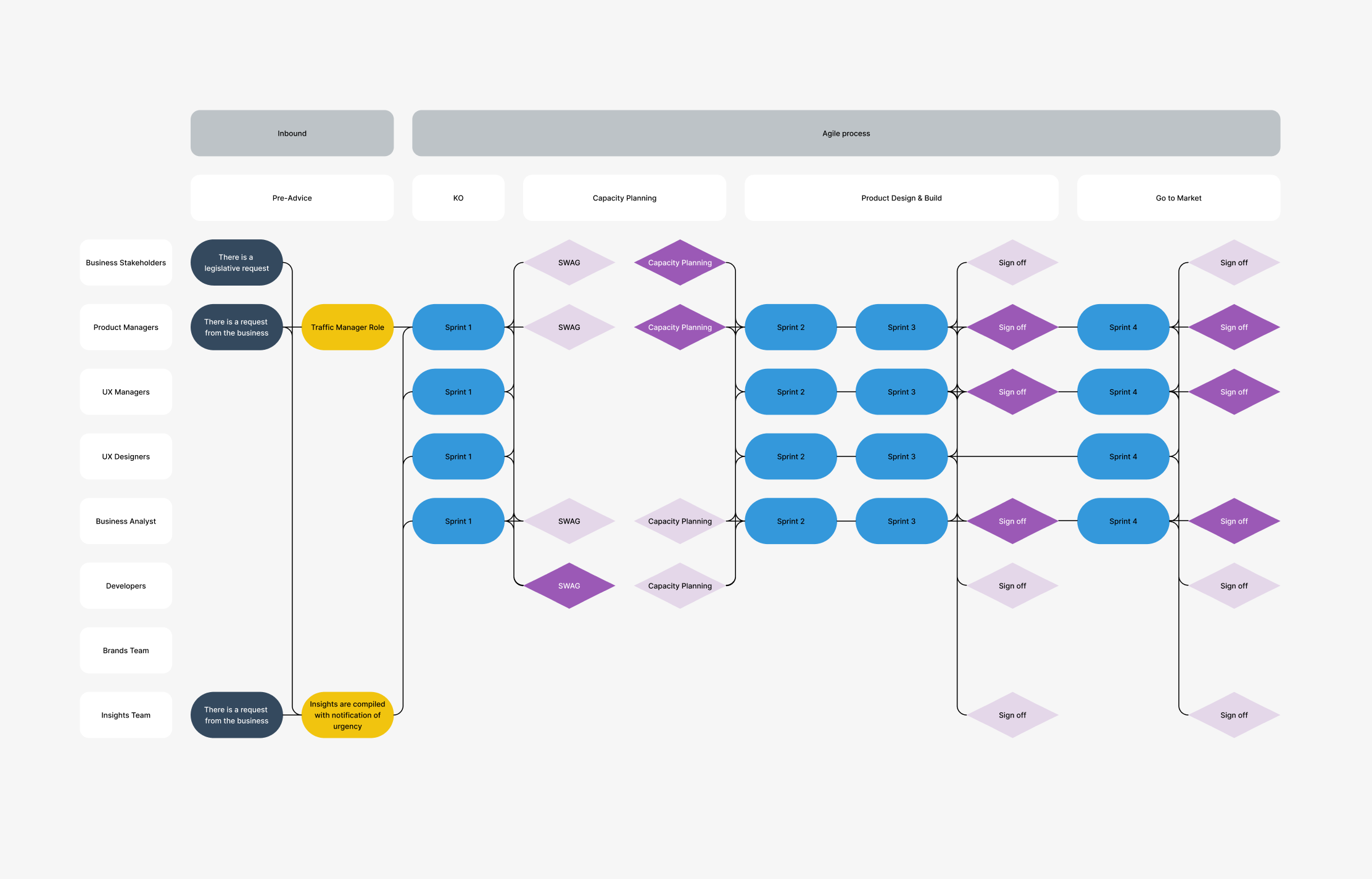
Product & UX Delivery Flowchart
Reshaping How the System Works
At this stage, the focus shifted to how the design system would operate across the organisation. We mapped how components moved through the system, from creation and review through to release and adoption. This helped clarify ownership and introduced a more structured way of managing change.
From this, we defined workflows that made it easier for teams to request updates, understand decisions, and stay aligned as the system evolved. At the same time, we shaped the structure of the platform itself, ensuring it could support multiple brands while maintaining a consistent foundation. The aim was to balance flexibility for local teams with consistency at a global level.
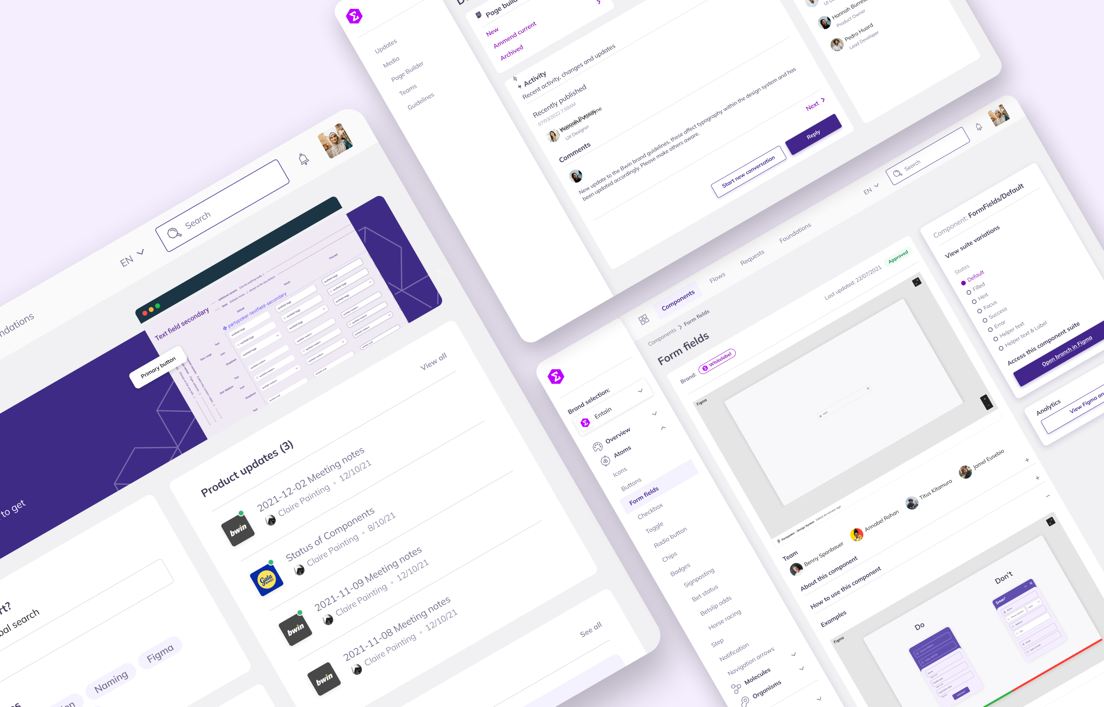
Visual exploration of ThemePark pages
Bringing the Platform to Life
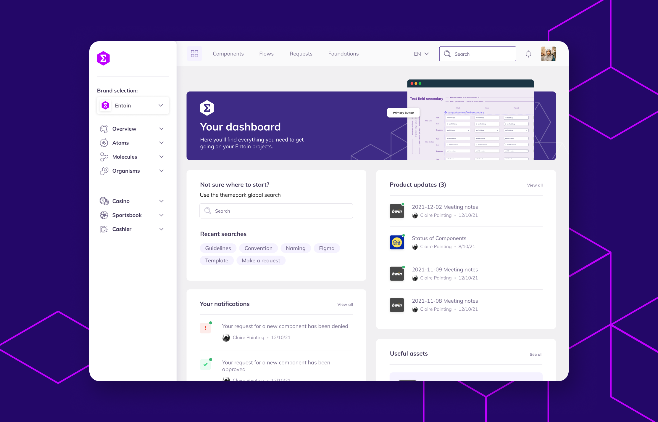
Dashboard
The dashboard became the central entry point into the system. It provides an overview of activity, including updates, requests, and relevant resources, helping teams understand where to go and what to do next.
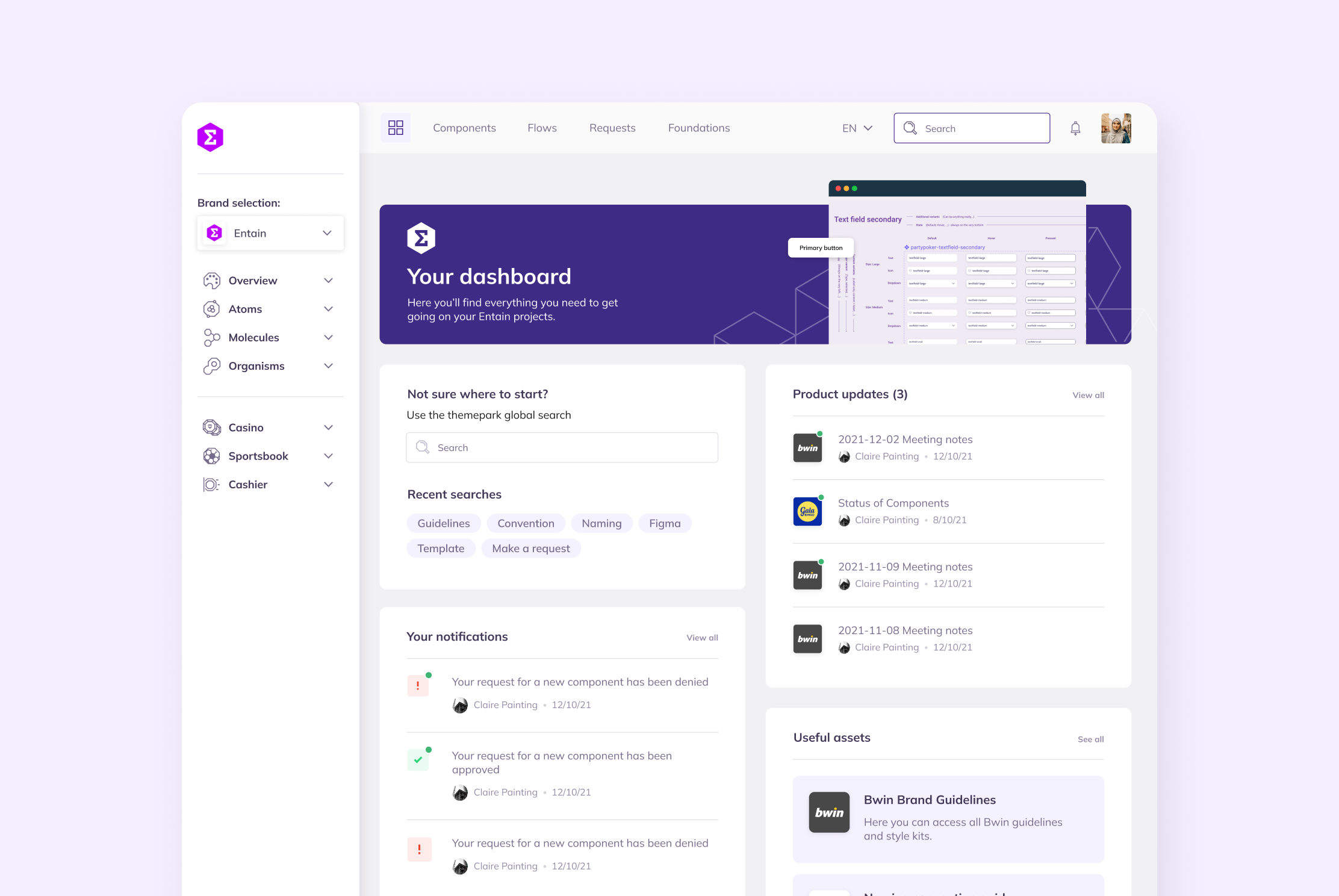
Dashboard Screen
Requests & Workflows
To support how the system evolves, we designed a structured request flow for new components and updates. This connects into tools like Jira, creating better visibility and clearer ownership around how changes are managed.
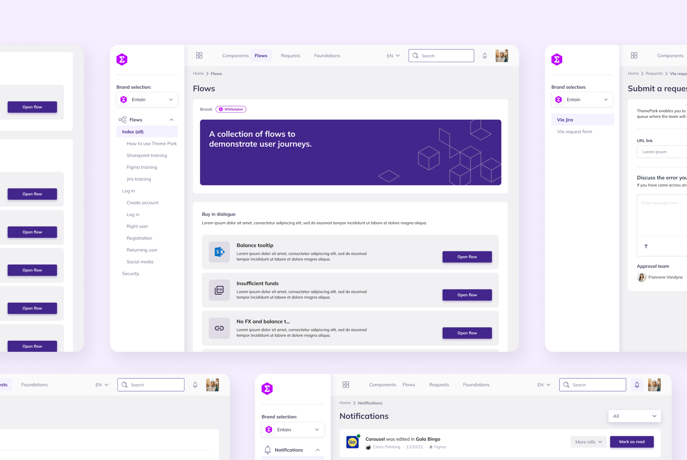
Flows + Request Form Screens
Component Library
The component library allows teams to explore and understand reusable UI elements. We structured this around clear naming, usage guidance, and examples so components could be adopted more consistently without teams needing to recreate them independently.
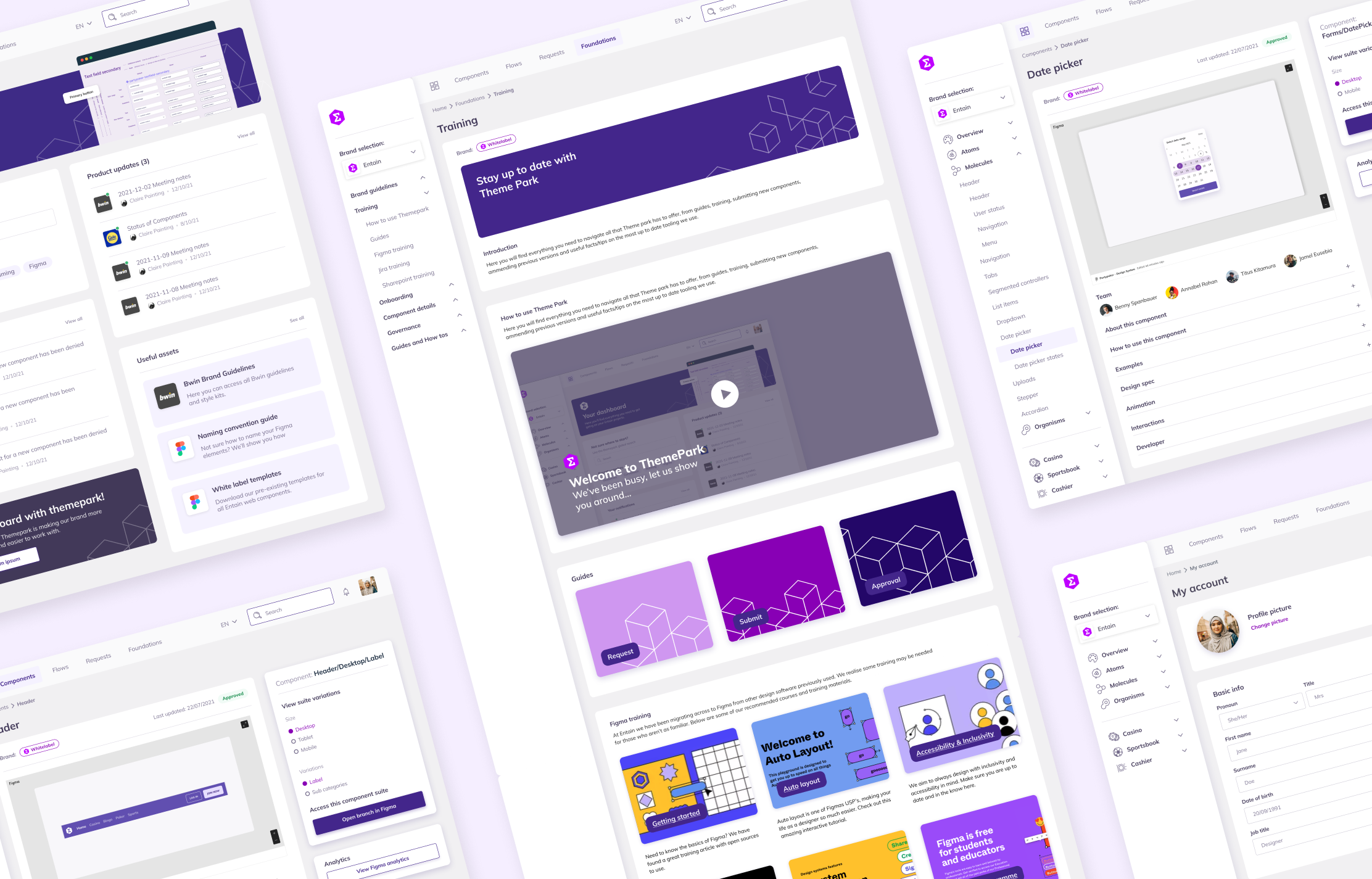
Foundations & Documentation
Alongside components, we created foundation pages covering typography, colour, and brand guidelines. These provide context for how the system should be used, helping teams understand not just what to use, but why. Embedding this into the platform reduced reliance on separate documentation.
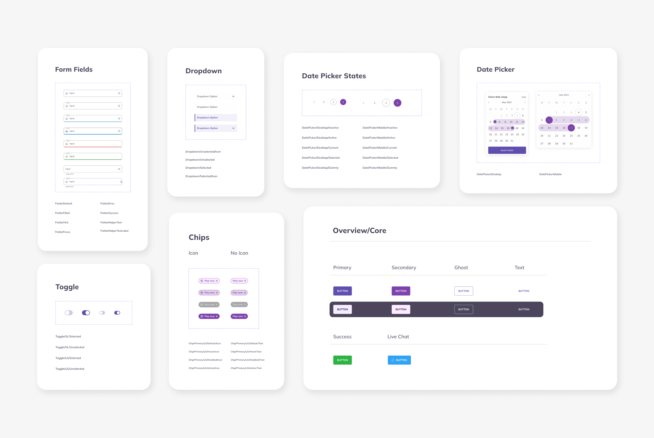
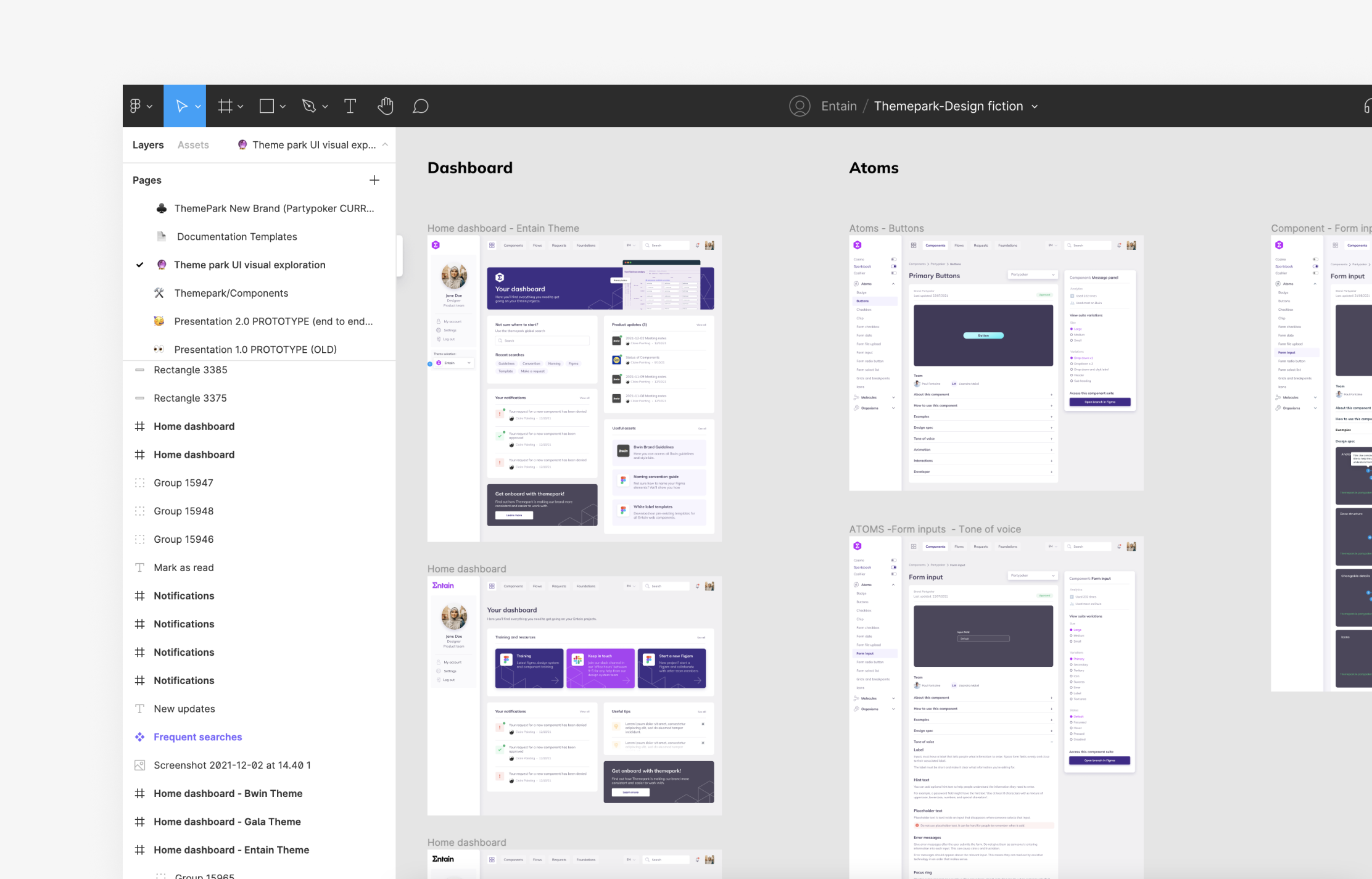
Component Library
Building the Design System
Rather than just creating components, we built a system that connects design, documentation, and development. Everything was structured to scale across multiple brands, with consistent naming and a clear hierarchy from simple elements through to more complex patterns. We also aligned the system closely with code to support handoff between design and engineering.
This established a single source of truth that teams could reference and build from over time.
Delivery Approach
The work was delivered iteratively, starting with core foundations and expanding into workflows and supporting tools. This allowed the system to develop progressively while aligning with teams across the organisation.
Entain Interface
Collaboration and Outcome
Working with Teams
Throughout the project, we worked closely with designers, engineers, and stakeholders to shape the system around how teams actually operate. This ongoing collaboration helped ensure the platform and workflows were grounded in real use cases, rather than being designed in isolation.
Outcome and Learnings
The work established a more structured and consistent approach to how design systems are used across Entain’s brands. It brought greater clarity to how components are created, managed, and shared, while also improving visibility across teams. One of the key learnings was the importance of aligning systems with how teams already work, rather than expecting teams to adapt to rigid processes. The foundations put in place created a base for the system to evolve further over time.

