
GSN
Summary
Mission
Gold Standard Nutrition (GSN) is a UK-based food brand offering healthier alternatives to traditional frozen meal prep. As the business expanded across ecommerce, wholesale and retail, the website began to struggle to support increasing customer demand and evolving purchasing behaviours.
Although the business had developed a strong product offering, products, bundles and subscriptions had been introduced over time as largely separate experiences. This made it harder for customers to understand the different ways they could shop, while also creating challenges for a business looking to scale its online offering. The goal of the project was to create a more connected ecommerce experience that improved product discovery, supported different purchasing journeys and provided a stronger foundation for future growth.
My Contribution
As the sole designer across a three-month engagement, I led the project from discovery through to final delivery. Working closely with stakeholders across the business, my role focused on understanding both customer and commercial challenges before translating those insights into a new ecommerce experience. This included research, journey mapping, information architecture, wireframing and visual design, while maintaining close collaboration with the client throughout the project.
GSN Storefront
Understanding The Challenge
Discovery
Before exploring solutions, I wanted to build a clear understanding of both the customer experience and the wider business challenges. Research combined stakeholder interviews, customer feedback, website analytics, reviews and behavioural insights to understand how customers currently interacted with the store, what influenced purchasing decisions and where friction existed throughout the journey.
Understanding the Business
Stakeholder conversations helped provide valuable context around the day-to-day challenges facing the business. While product ranges continued to grow, there was an increasing need to help customers discover the right products and better understand the different ways they could purchase. Alongside these customer-facing challenges, stakeholders also highlighted the need for a platform that could better support future growth and increasing product complexity.
Learning from the Market
Alongside stakeholder research, I reviewed competitors operating within the same market to understand how similar brands approached product discovery, subscriptions and bundle purchasing. The goal wasn't to replicate competitors, but to identify common patterns, strengths and opportunities that could help strengthen the customer experience.
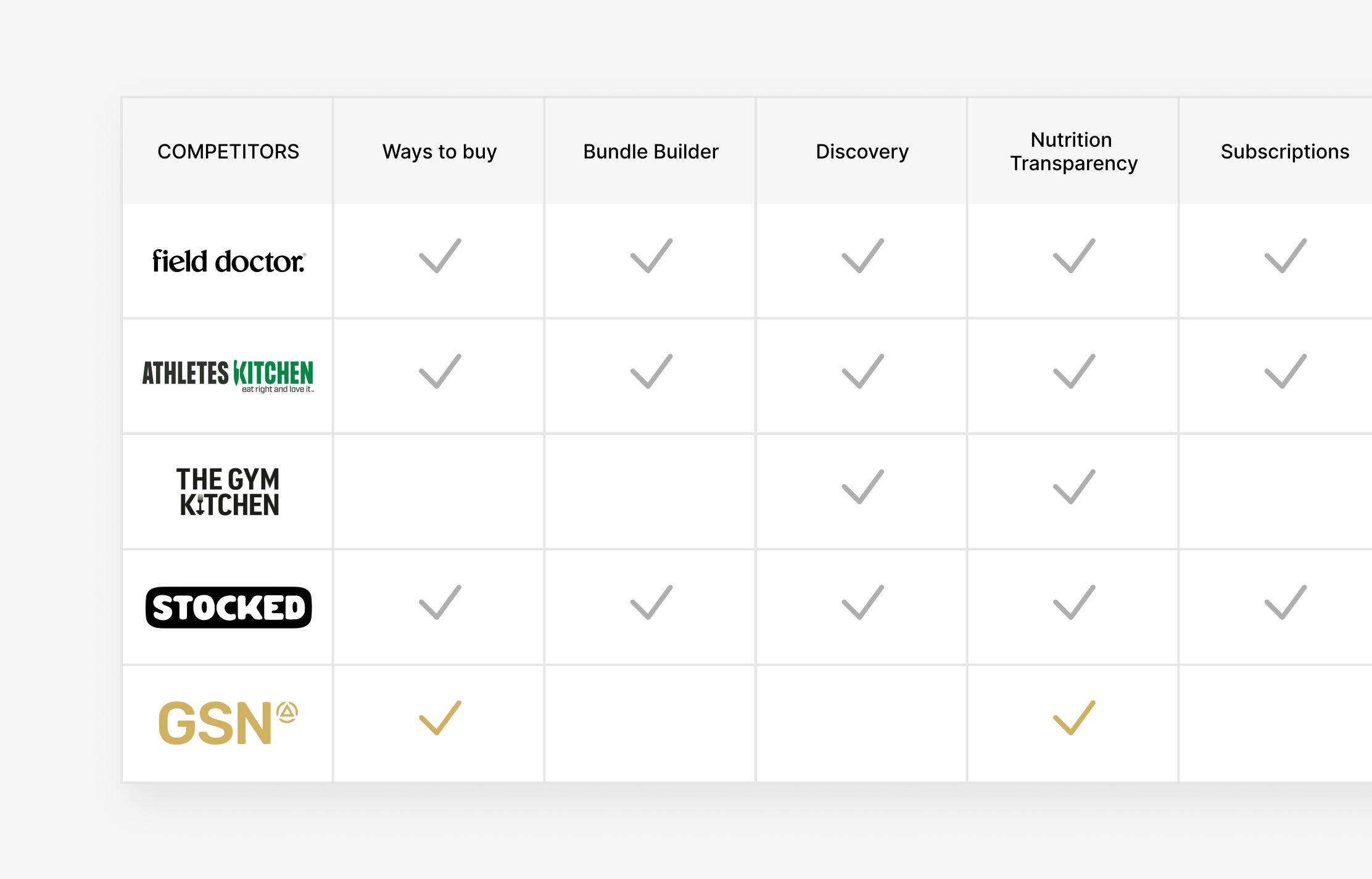
Competitive Analysis + Market Review
Defining the Opportunity
As findings were synthesised, several themes began to emerge. Many of the challenges weren't isolated issues, but symptoms of a broader experience that lacked continuity. Customers could purchase meals in different ways, but those journeys often felt disconnected from one another. This created an opportunity to simplify discovery, support different shopping behaviours and create a more cohesive eCommerce experience.
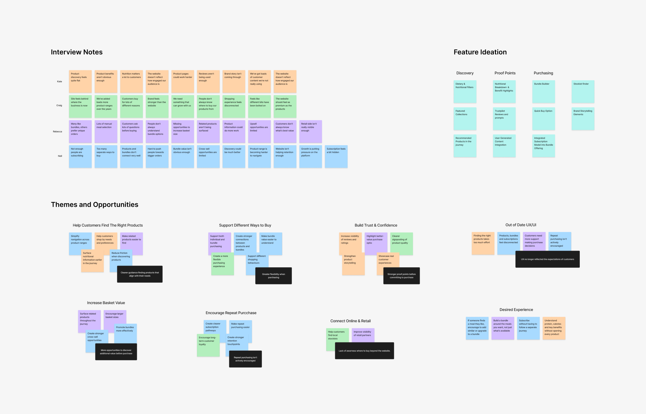
Research Synthesis Board
Designing the experience
Connecting Customer Journeys
With the opportunity areas defined, the next step was understanding how products, bundles and subscriptions could work together as part of a more connected experience. User flows helped map the primary purchasing journeys, validate decision points and ensure previously disconnected experiences felt more joined-up before moving into design.
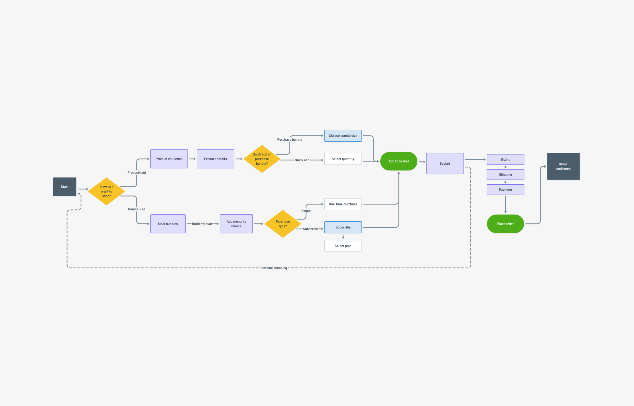
Key Purchasing Flowchart
Validating through Wireframes
Before moving into visual design, wireframes were used to explore page structure, content requirements and navigation patterns. This phase helped validate ideas with the client while ensuring the experience could support different customer needs and purchasing behaviours.
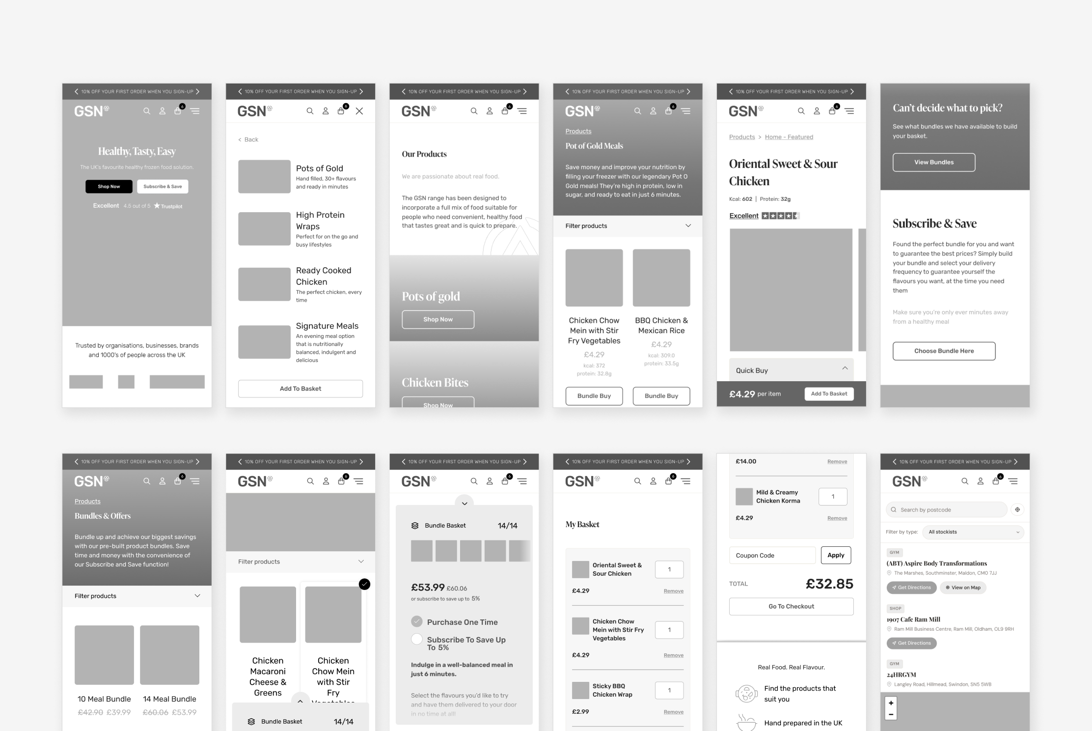
Hi-fi Wireframes
Establishing Design Principles
One thing I wanted to be clear on before moving into design was what success looked like for the experience. Three principles emerged from the research and became the foundation for decision-making throughout the project: making product discovery easier, supporting different ways to shop and helping customers feel more confident when making purchasing decisions.
Bringing the Experience to Life
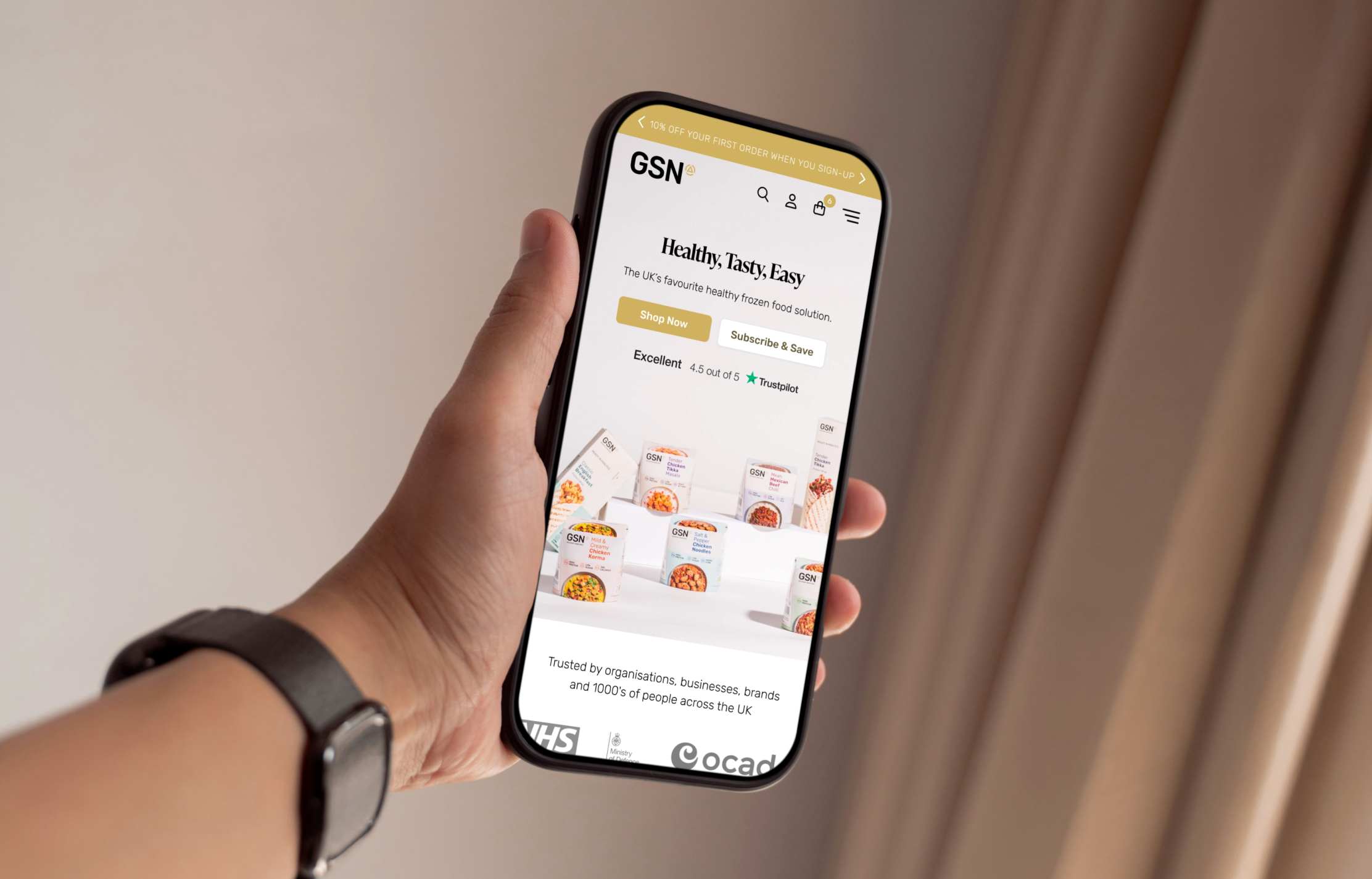
With the foundations established, the focus shifted towards creating a cleaner and more approachable ecommerce experience. Stronger product imagery, clearer content hierarchy and simplified buying pathways helped reduce complexity whilst making it easier for customers to discover products, understand their options and navigate the store with confidence.
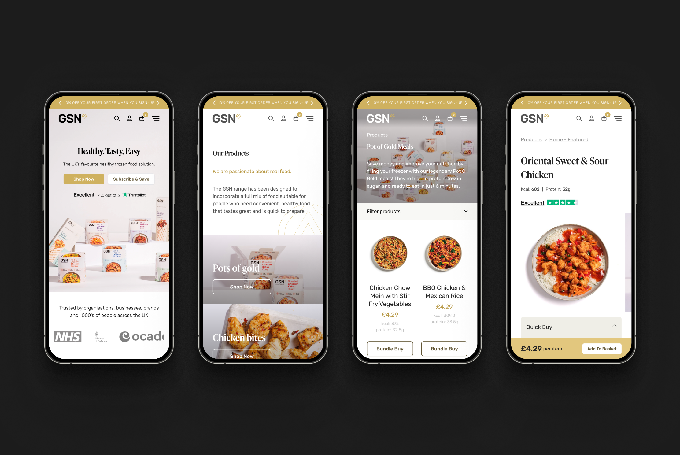
Home + Product Listings, Details
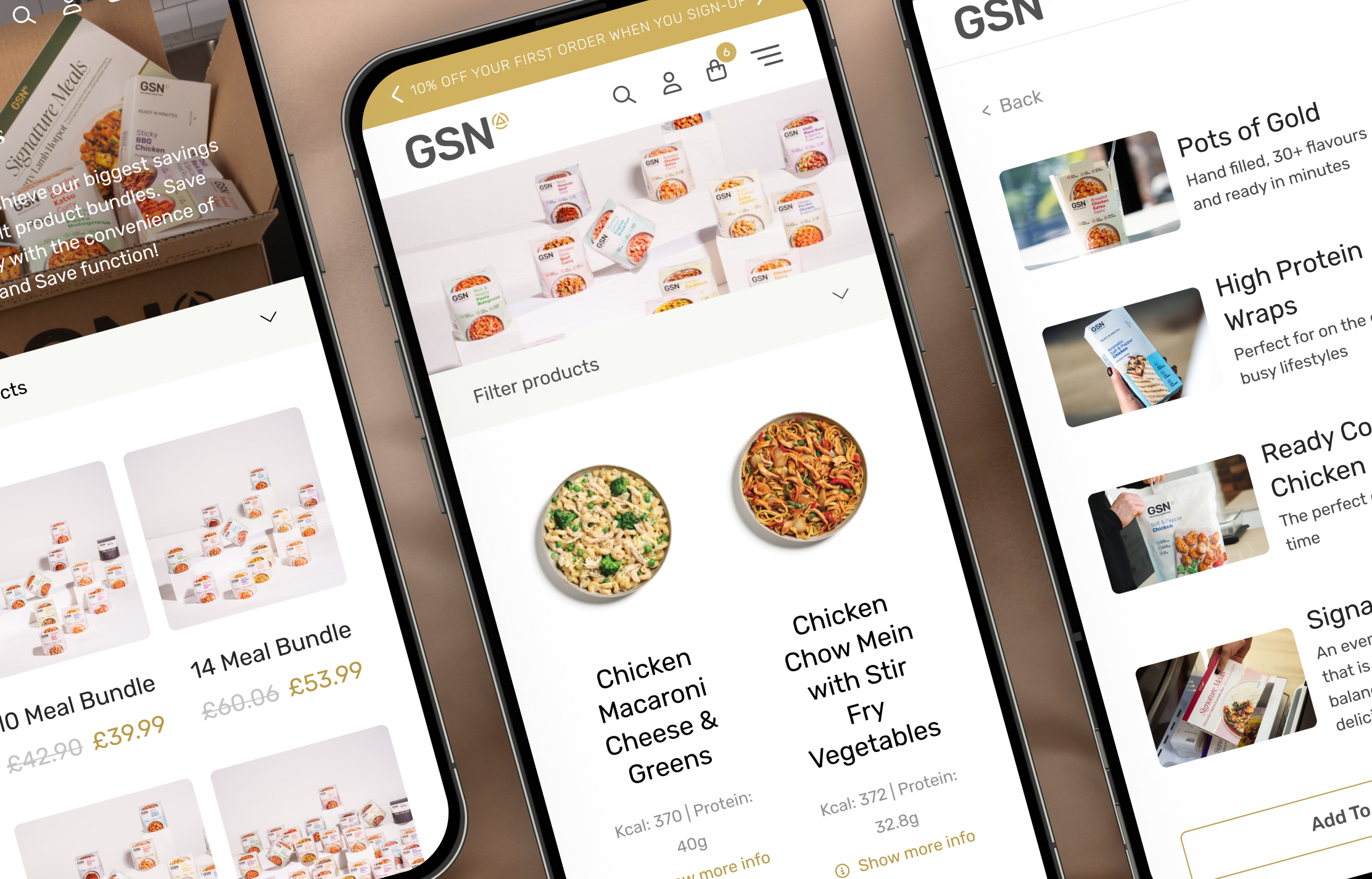
Supporting Different Ways to Shop
One of the key challenges identified during discovery was that products, bundles and subscriptions had evolved as separate experiences. The redesign looked to bring these journeys closer together by surfacing alternative purchasing options throughout the experience, helping customers explore different ways to buy without disrupting their journey.
Helping Customers Purchase with Confidence
To support decision-making, detailed nutritional information, product benefits, reviews and customer testimonials were introduced throughout the journey. These trust signals helped customers better understand products at key moments and provided additional reassurance before purchase.
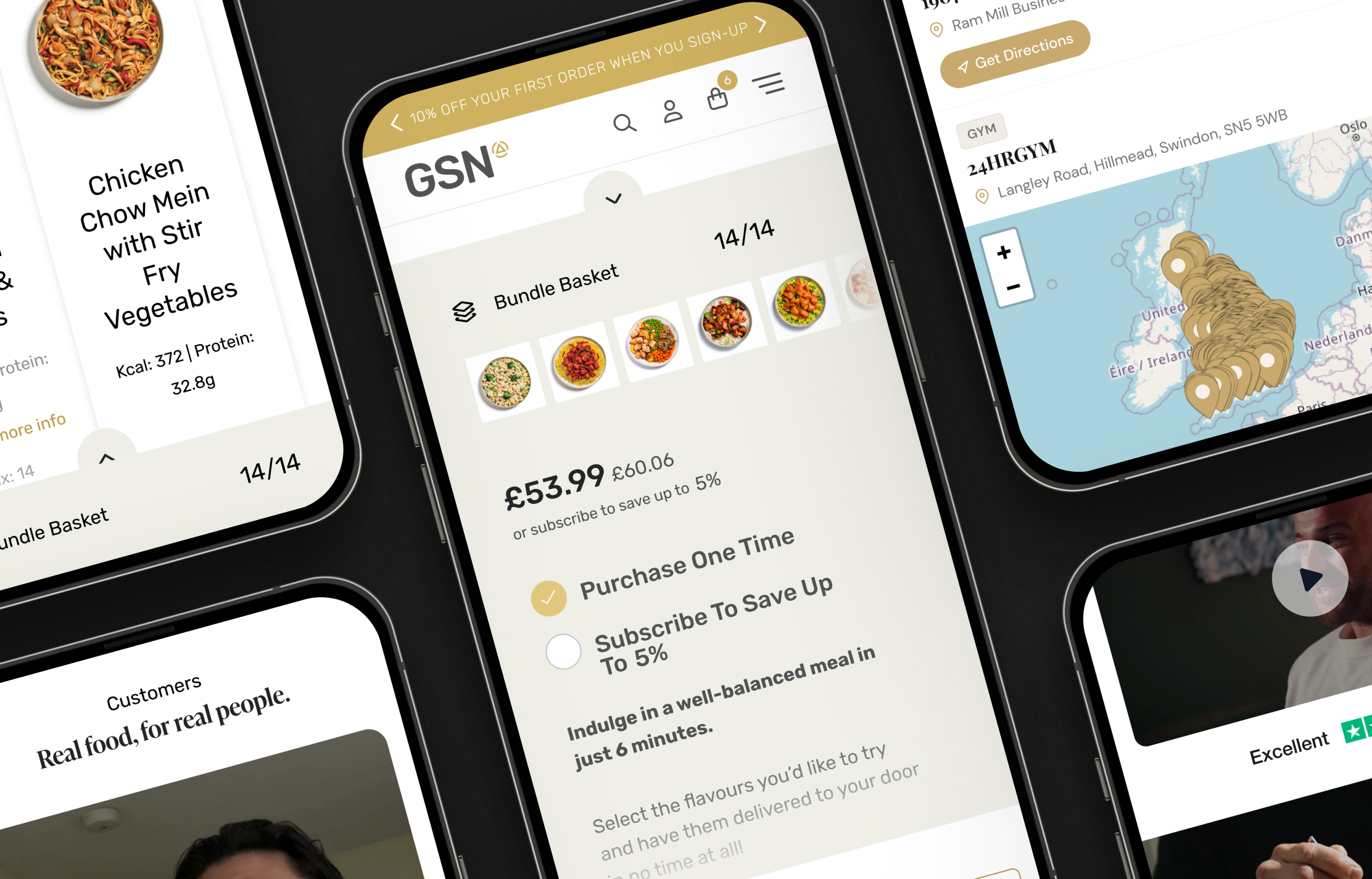
Bundle Builder + Trust Signals
Outcome
The redesigned experience contributed to a 25% increase in website traffic and a 3% uplift in conversion rate. Just as importantly, it provided the business with a more structured and scalable ecommerce platform capable of supporting future growth, expanding product ranges and evolving customer needs.
Reflection
One of the biggest learnings from the project was the importance of designing around customer intent rather than individual product types. By understanding the different ways customers wanted to shop, we were able to create a more connected experience that supported product discovery, bundle purchasing and subscriptions within a single journey. Looking back, I'd be interested in exploring the bundle-building journey further. Customers were intentionally taken directly from bundle creation into basket to maintain momentum towards checkout, but there would be opportunities to better understand completion behaviour and identify further optimisation opportunities over time.

