
Ladbrokes
Summary
Mission
To review and improve the Ladbrokes onboarding experience by identifying usability issues, reducing friction across the journey, and improving conversion from sign-up through to first deposit and bet.
My Contribution
I led the UX work end to end, starting with an expert review of the onboarding journey and working through to a redesigned experience. This included identifying key issues, shaping recommendations, and turning those into a clearer onboarding flow through wireframes and final UI. I worked closely with stakeholders throughout to align on priorities and make sure the work balanced user needs with business goals.
Redesigned Onboarding Screens
Understanding the existing experience
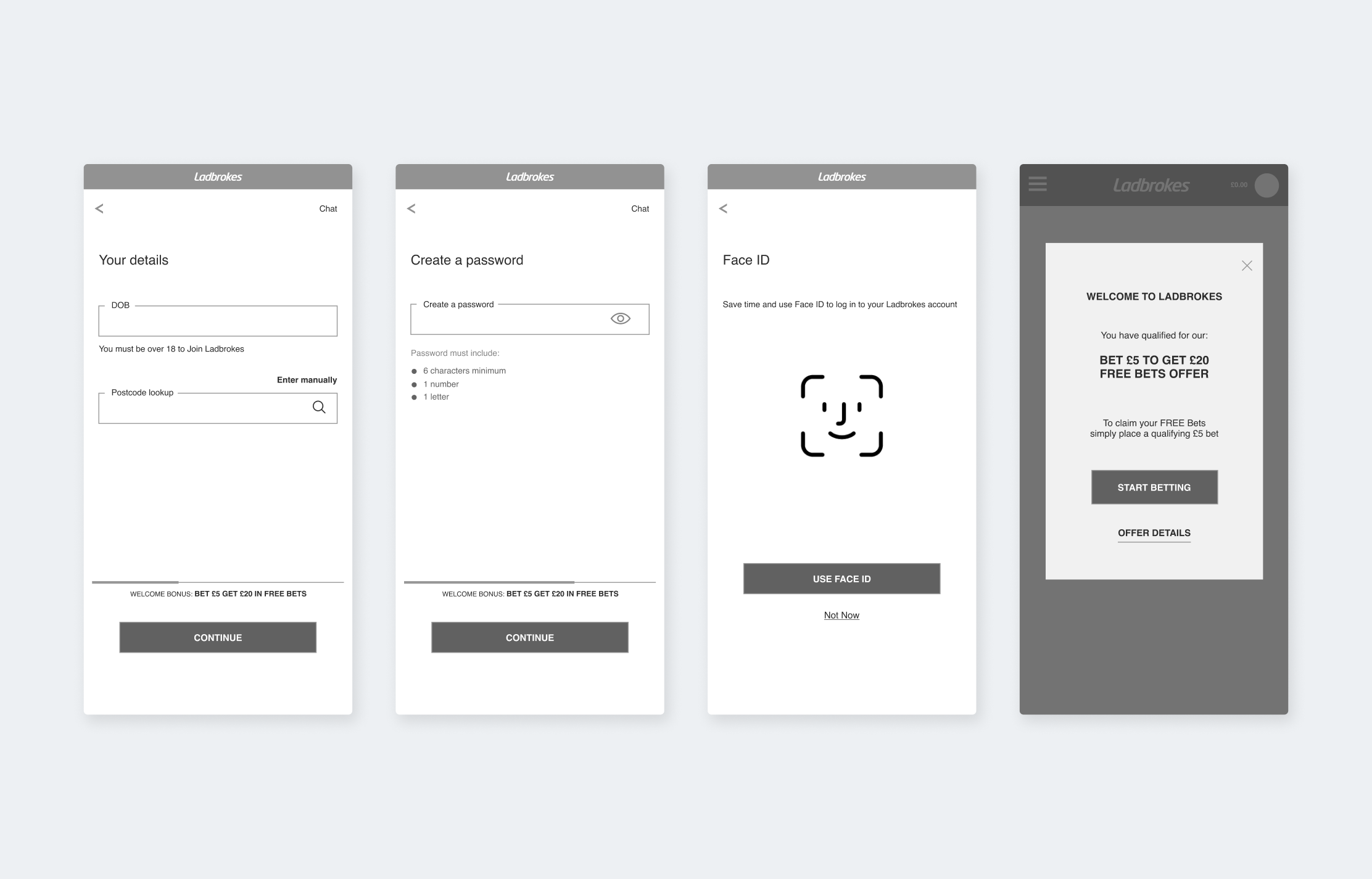
I started by reviewing the full onboarding journey to understand where things were breaking down and why users might be dropping off. What stood out quite quickly was a lack of structure. The flow didn’t always feel connected, and users were often faced with too much information at once. It wasn’t always clear what the next step was or what was expected of them.
There were also issues with how content was prioritised. In some places, promotional messaging distracted from the task at hand, making it harder for users to stay focused and complete the process. This gave us a clear picture of the main problem areas and where to focus.
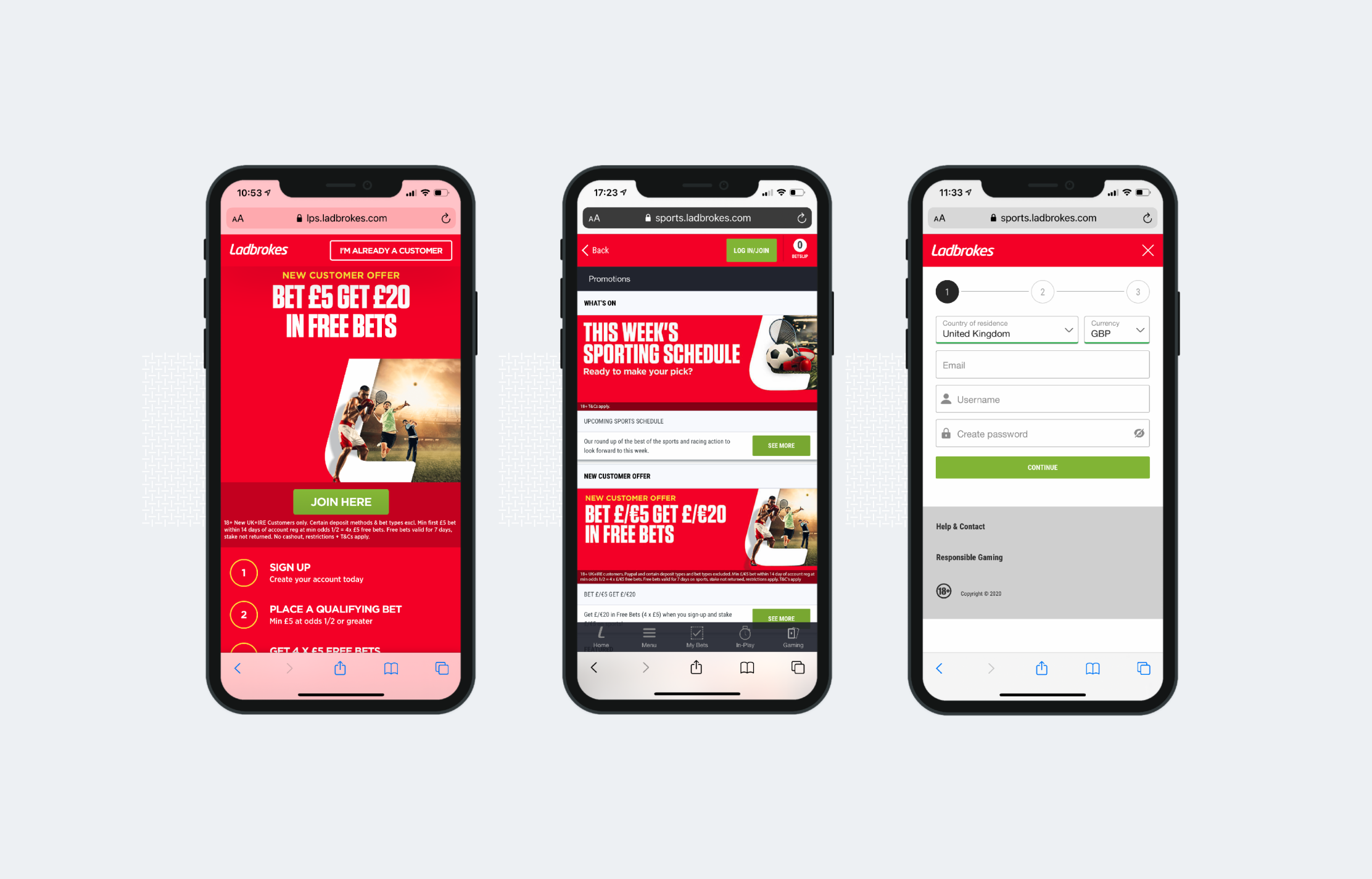
Past Onboarding Flow
Structuring opportunity
From there, I pulled the findings into a set of clear, prioritised recommendations. Some of these were quick wins, like simplifying form inputs, improving hierarchy, and making actions more obvious. Others were bigger changes around how the journey itself could be restructured to feel more guided and easier to follow.
Alongside this, I also defined a future vision to show what a better version of onboarding could look like if we went beyond small fixes. This helped get alignment on both short-term improvements and longer-term direction.
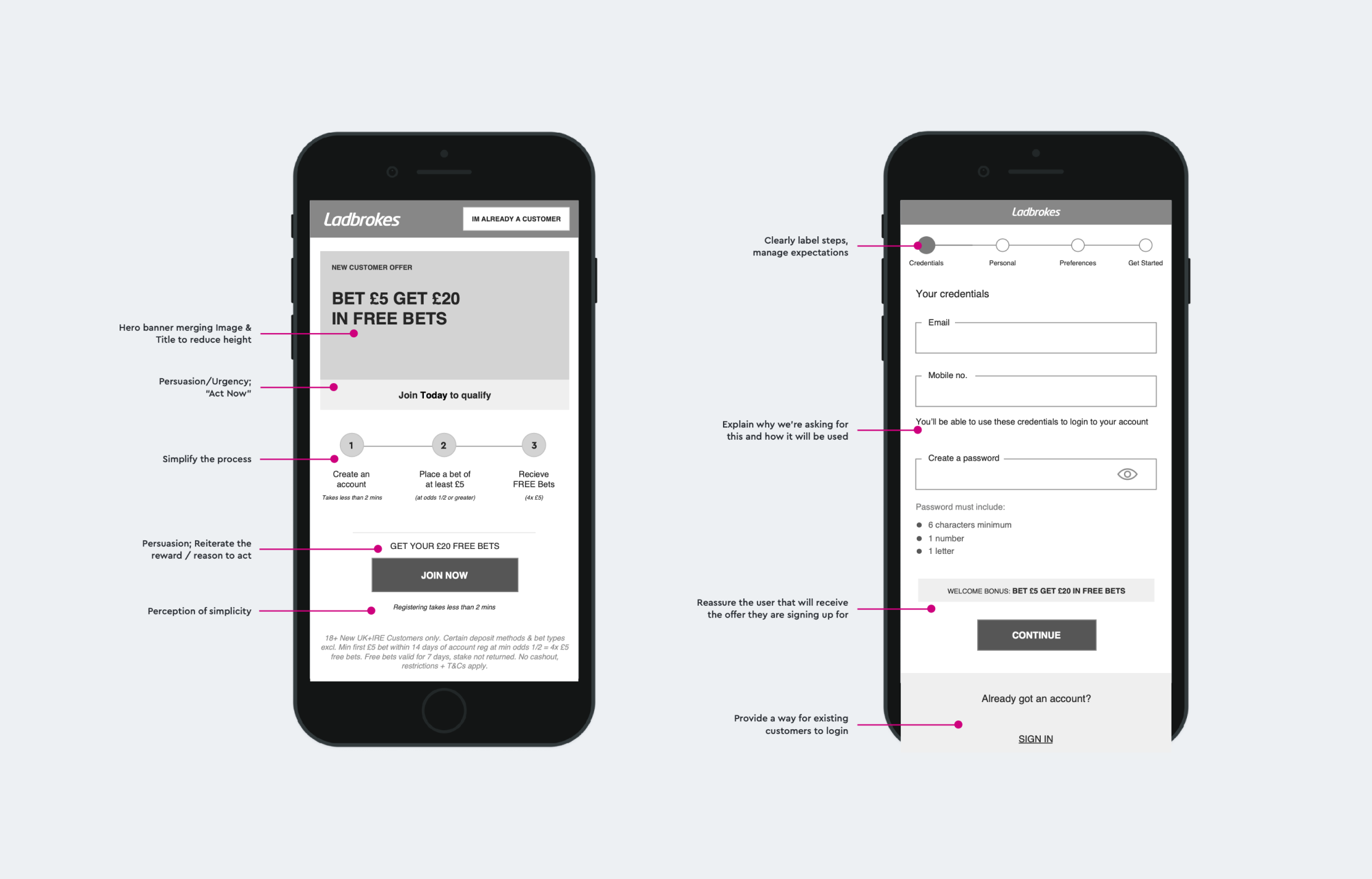
Recommendations + Opportunity Areas
Wireframes
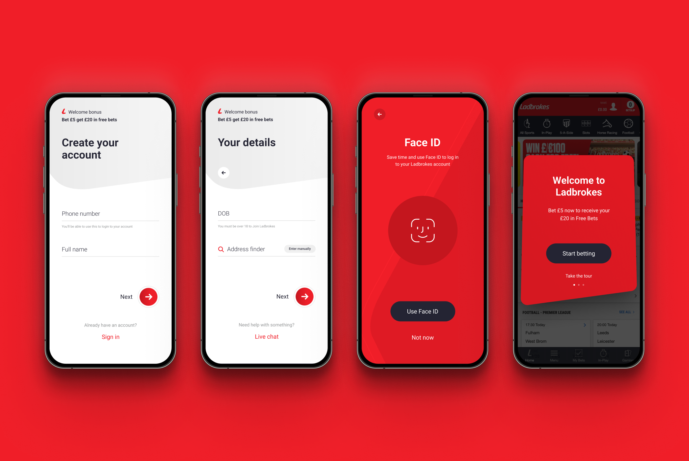
Once we aligned on the direction, I moved into wireframing the new onboarding flow. The goal here was to make the journey feel much more structured. Instead of one long process, it was broken down into clear steps like account setup, personal details, and preferences. This made it easier for users to focus on one thing at a time.
I also spaced decisions more carefully across the journey, so users weren’t overwhelmed early on. Overall, it made the process feel more manageable and easier to complete.
Onboarding Flow
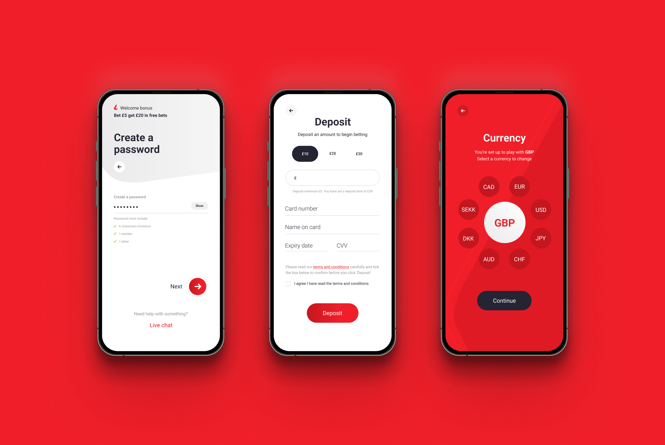
Improving clarity and interaction
From there, I focused on how each step actually worked in practice. Forms were simplified, labels were made clearer, and actions were made more consistent so users always knew how to move forward. The aim was to remove any unnecessary friction and make interactions feel predictable.
Things like Face ID and communication preferences were kept as optional steps, but positioned in a way that felt helpful rather than intrusive.
Form Input Screens
Aligning goals within the journey
Another key part of the work was making sure the experience supported business goals without getting in the user’s way. Promotional messaging was reworked so it supported the journey rather than competing with it. Instead of front-loading everything, it was carried more naturally through the flow. The move into deposit was also handled more carefully, so it felt like a natural next step rather than a sudden ask. This helped create a smoother path from sign-up to first action.
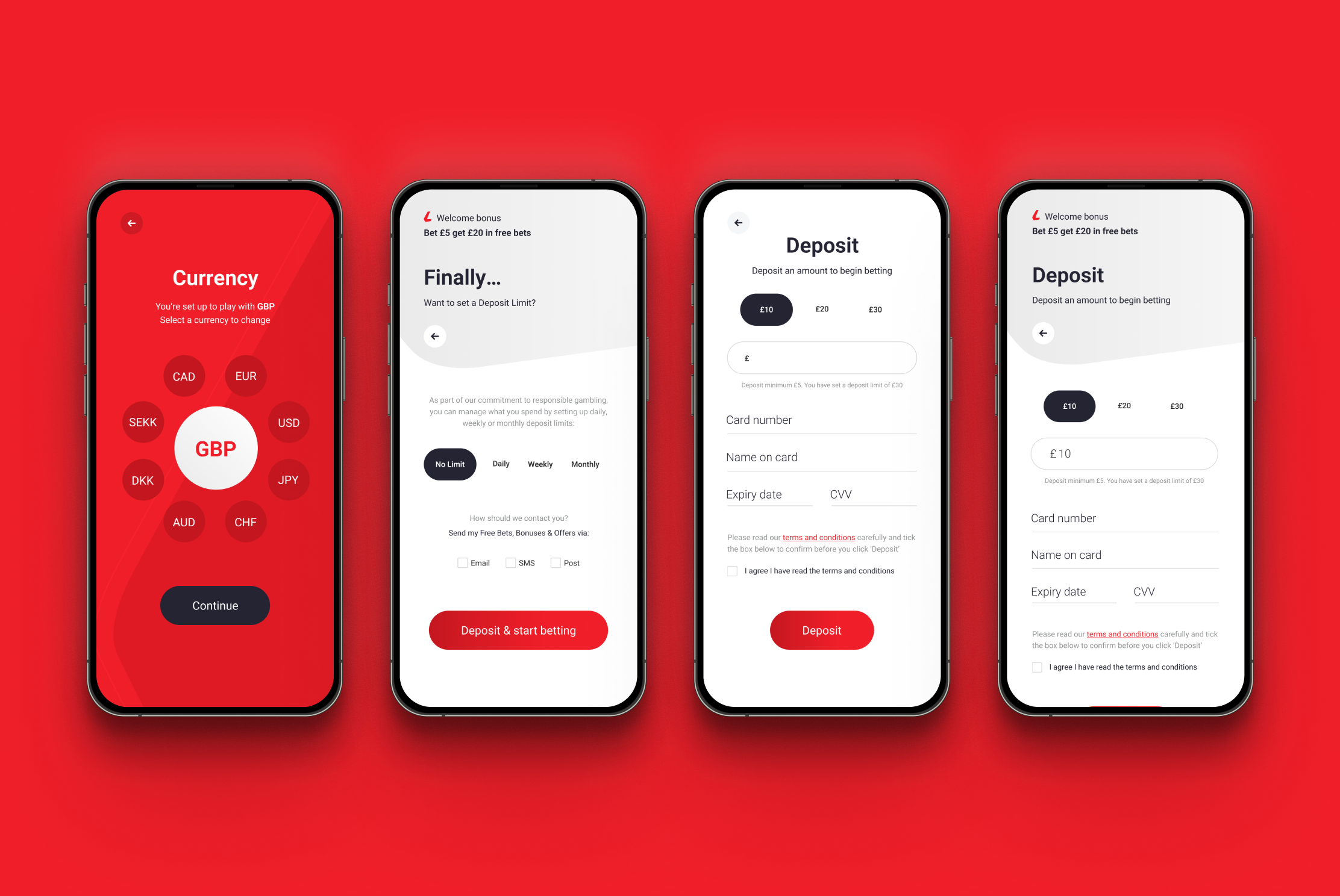
Deposit Screens
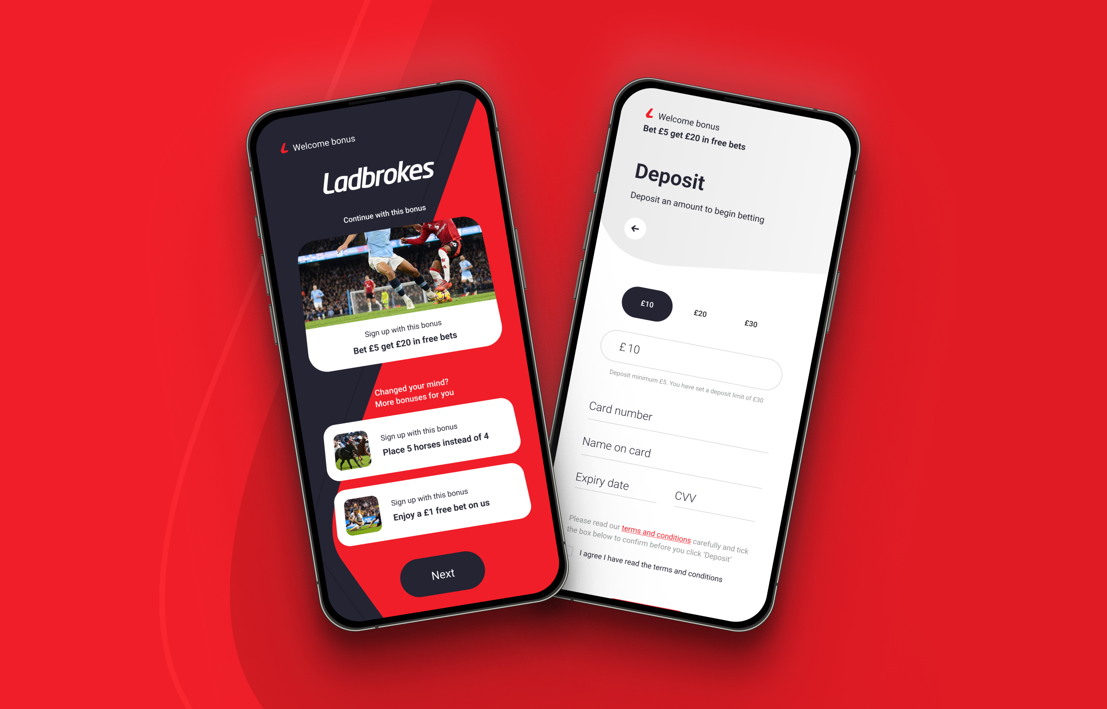
Bringing the experience to life
With the flow and interactions defined, I moved into designing the final UI. The focus here was on keeping things clear and easy to follow. Layouts were simplified, hierarchy was stronger, and components were used consistently so the experience felt familiar as users moved through each step. Brand was applied in a way that supported the experience, highlighting key moments without overwhelming form-heavy parts of the journey.
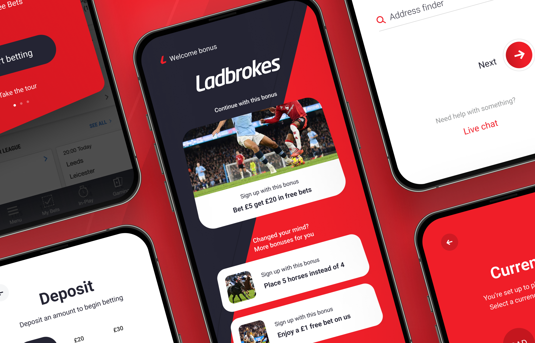
Final Onboarding Screens
Outcome
The project resulted in a clear UX review, a set of prioritised recommendations, and a redesigned onboarding experience from concept through to final UI. It gave the team both immediate improvements to act on and a clearer direction for how the experience could evolve over time.
Reflection
This project reinforced how important structure and clarity are in onboarding. Small issues in how information is presented can quickly add up and create friction. It also highlighted the value of connecting insight to execution. The real impact came from not just identifying problems, but turning them into something tangible that could actually be built and improved.

