
Zuto
Summary
Mission
Zuto wanted to improve MyZuto so it felt more joined up and easier to use for both customers and internal teams across the full car finance journey. The experience had grown over time without much structure, which meant customers often felt unsure about what was happening, while internal teams had to rely on manual work and disconnected systems to keep things moving. The goal was to create something that felt clearer, more reliable, and easier to navigate, while also supporting how the business actually works behind the scenes.
My Contributions
As a Lead Designer on this project, I helped Zuto bring structure to their problem by working through stakeholder insights, mapping how the service currently worked, and identifying where the biggest issues and opportunities were across onboarding, vehicle search, and post sale. I designed key parts of the experience including onboarding, the dashboard, and search, and also building out a design system so the product could stay consistent as it evolved. Work also involved prototyping and testing, making sure what we designed actually worked for both customers and the internal teams using it day to day.
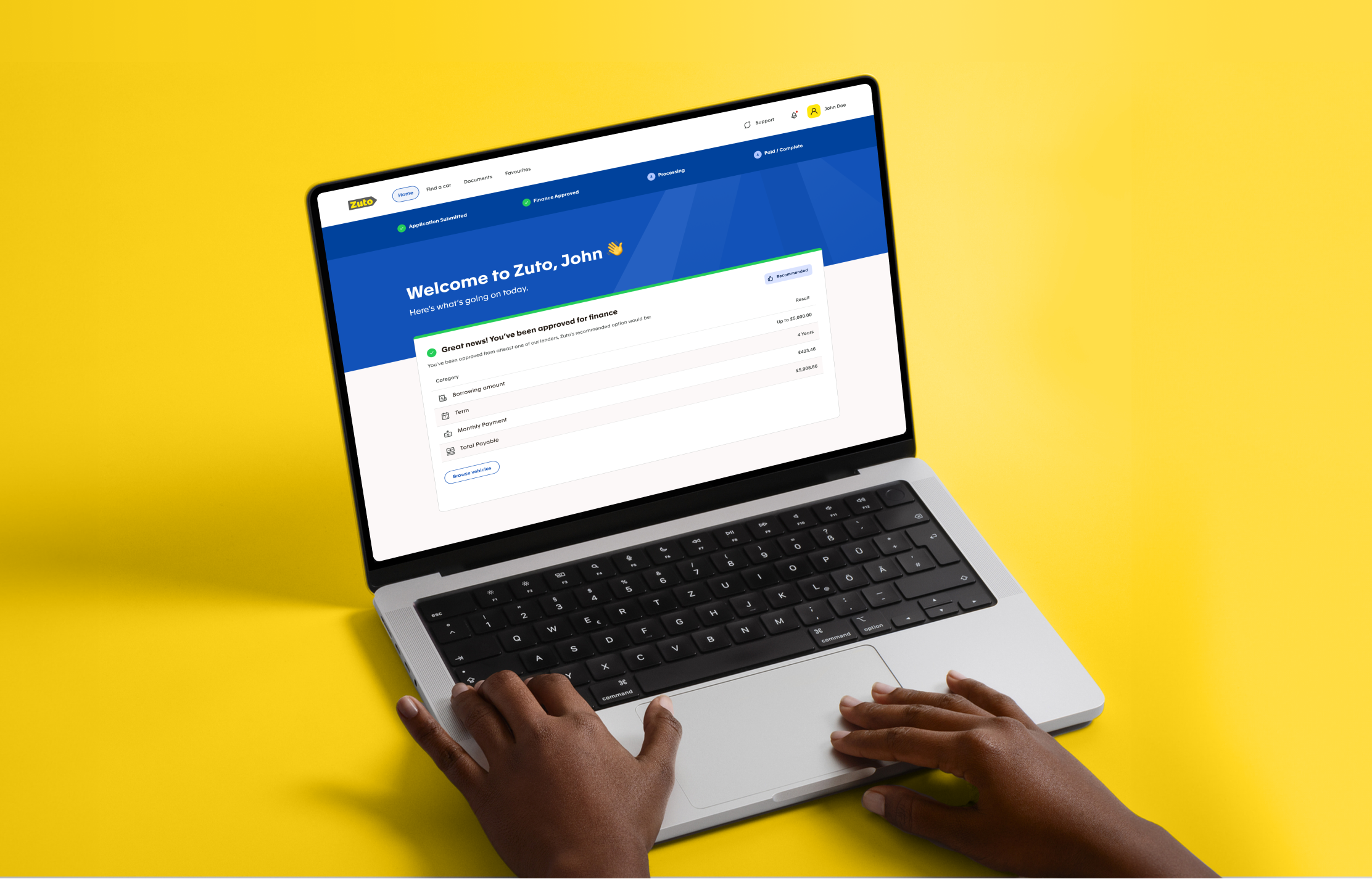
Dashboard Screen
Laying the Foundations
Discovery
We started by speaking to stakeholders across the business to understand how MyZuto currently worked and where things were breaking down. It quickly became clear that the issues went beyond just usability. The experience was spread across different systems and teams, which made it hard for customers to understand where they were in the process. Communication was inconsistent, and internal teams had to do a lot of manual work to fill in the gaps. This showed us that the real problem sat across the whole service, not just the interface.
Understanding the Current Service
To get a clearer picture, we mapped the full journey from start to finish, looking at both the customer experience and what was happening behind the scenes. This helped us see how everything connected and where things were falling apart. Customers were often getting lots of communication but still didn’t feel informed, while internal teams were dealing with slow and fragmented systems that made their jobs harder. Mapping this out gave everyone a shared understanding of the current state and made it easier to agree on where to focus.
Prioritising Opportunities
Once we understood the problem, the next step was to decide what to tackle first. We mapped out different opportunities based on how much impact they could have and how difficult they would be to deliver. This helped us focus on the areas that would make the biggest difference without overcomplicating things. Three clear areas stood out, onboarding and dashboard, vehicle discovery, and post sale, which gave us a simple structure to move forward with.
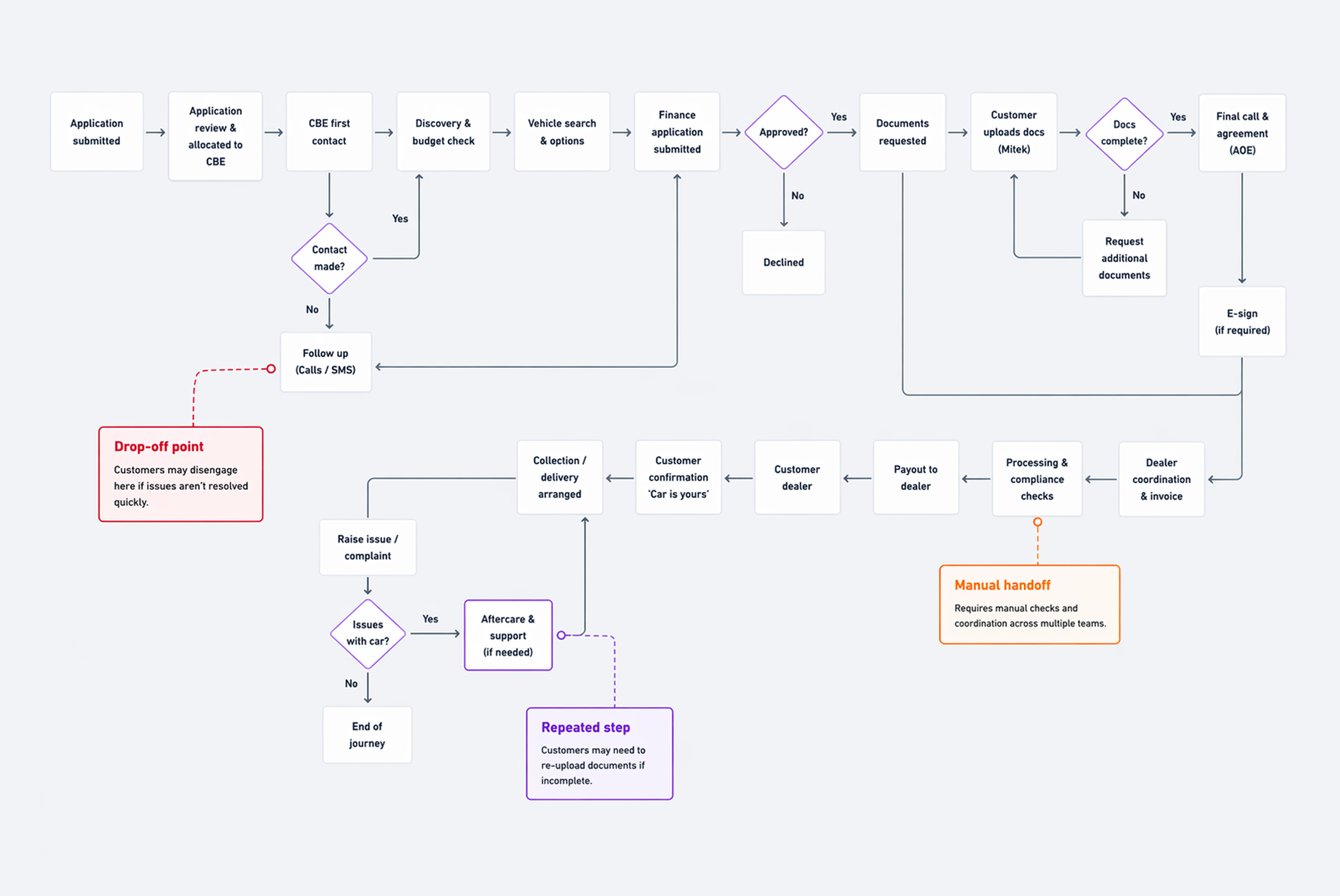
Service Flowchart + Key Points of Friction
Wireframes
With the key opportunity areas defined, we moved into wireframes to shape how the experience would work in practice. This allowed us to explore structure and user flows without getting distracted by visual design.
The focus was on onboarding and the dashboard, helping us map out key steps and understand how the experience would adapt across different stages of the journey.
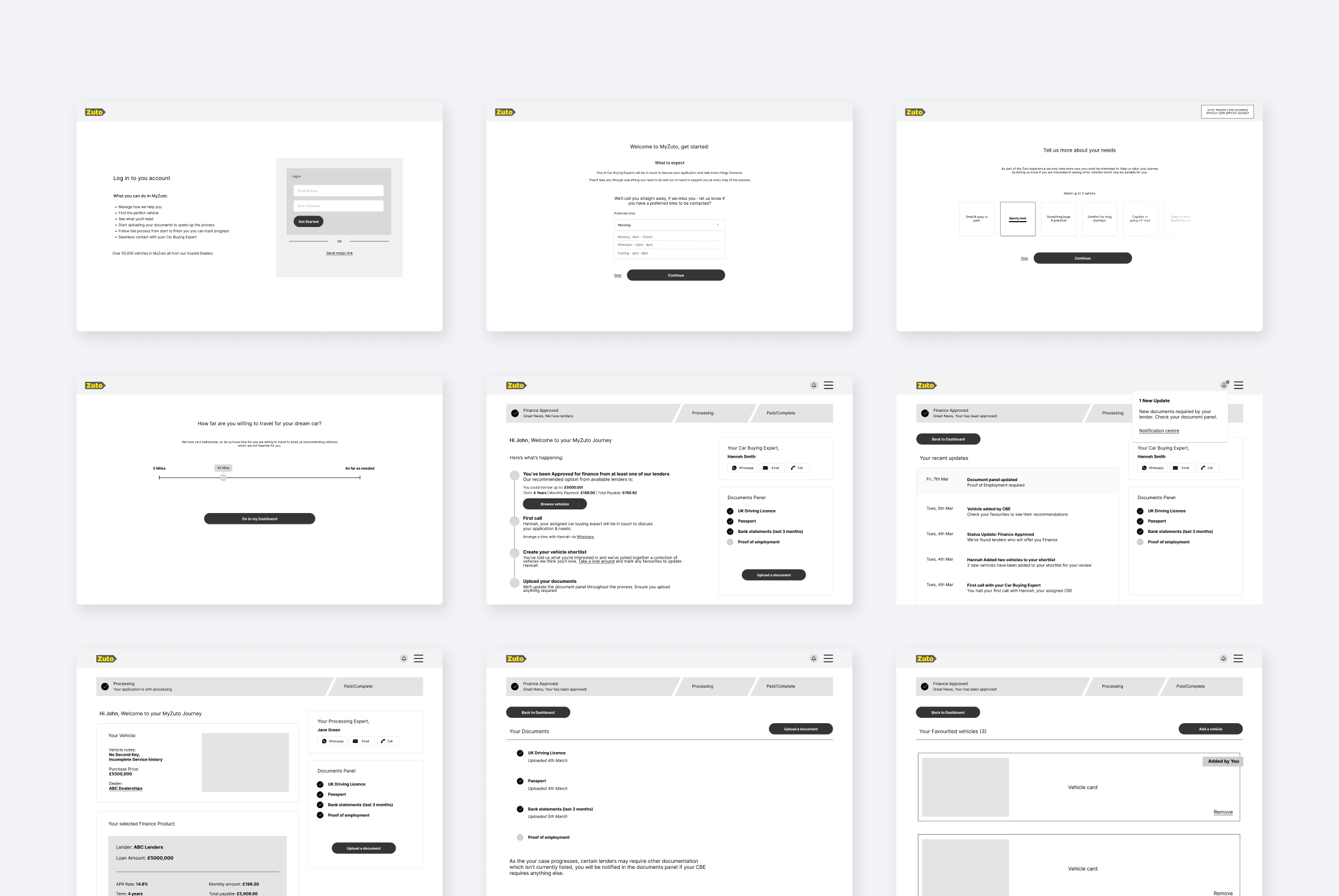
MyZuto Wireframes
Designing the experience
Onboarding
We focused on making the start of the journey feel clearer and more structured. This meant helping users understand what was expected of them, what would happen next, and where they were in the process. The aim was to remove early friction and give users confidence from the outset.
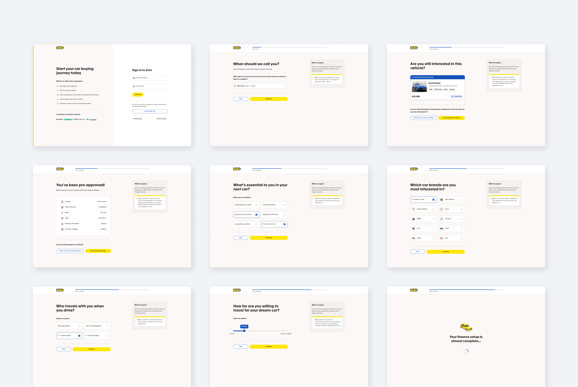
Onboarding Screens
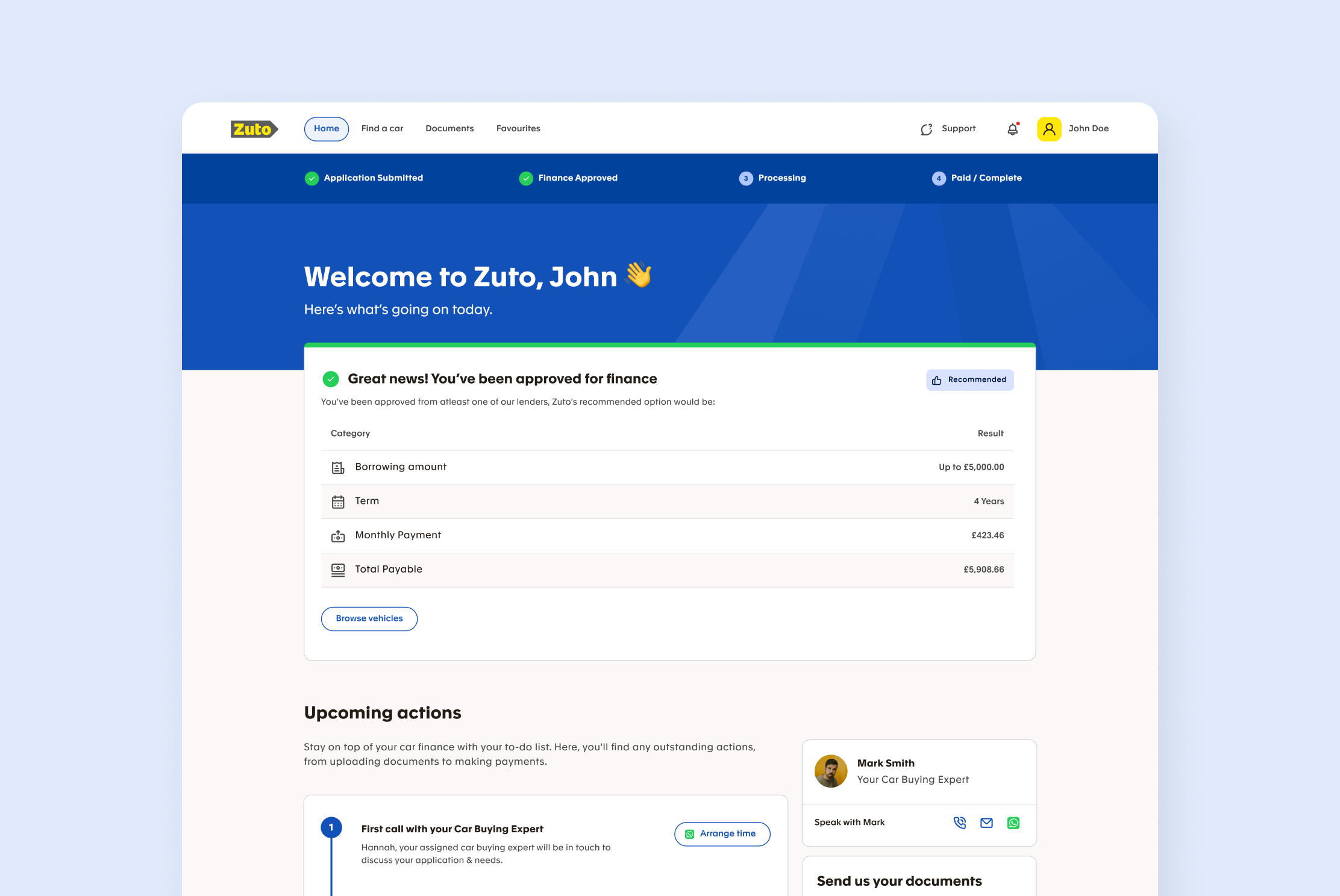
Dashboard
The dashboard became the central place for users to understand their progress and manage their journey. A key objective was to reduce reliance on support by giving users better visibility into their status, next steps, and any actions required, helping them feel more in control.
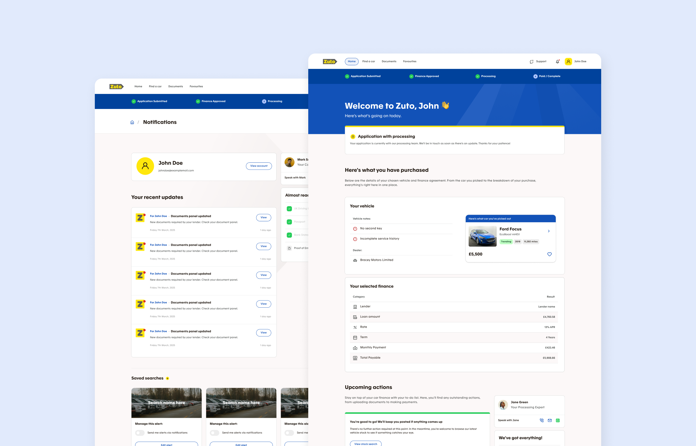
Dashboard Screens
Vehicle Discovery
Search needed to do more than just return results. We explored how it could help guide users toward the right choice by improving filters, introducing more relevant recommendations, and making it easier to compare options. The aim was to make users feel more confident in their decisions rather than overwhelmed by choice.
Post Sale Experience
One of the biggest gaps was what happened after a deal was completed. The experience often just stopped, leaving users unsure about next steps. We extended this part of the journey to include clearer updates, support, and follow up communication so it felt like a continuous experience rather than a one off interaction.
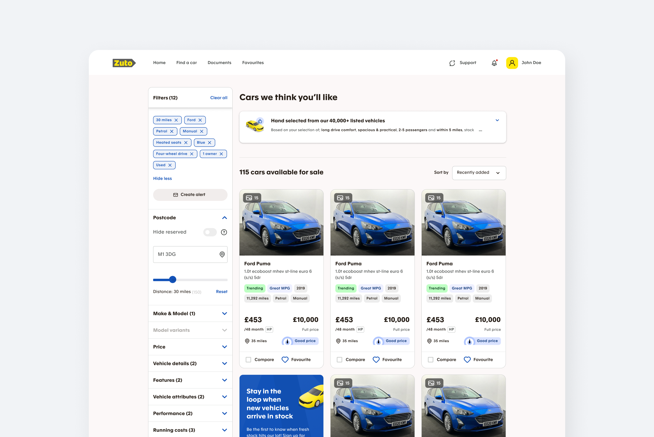
Vehicle Stock Search Screen
Design System
As we worked through the product, it became clear that there wasn’t a consistent design foundation in place. Different parts of the experience had been built in isolation, which led to inconsistencies. To fix this, we created a design system that defined the core visual language and a set of reusable components that could be used across the product. Everything was documented in Figma so the team could continue using and building on it after the project, making future work faster and more consistent.
Execution
The work was delivered in stages, starting with onboarding and dashboard before moving into search and post sale. Each phase built on what we had already learned, allowing us to gradually shape the experience rather than trying to solve everything at once. This made it easier to test ideas, refine them, and keep the work grounded in real user needs.
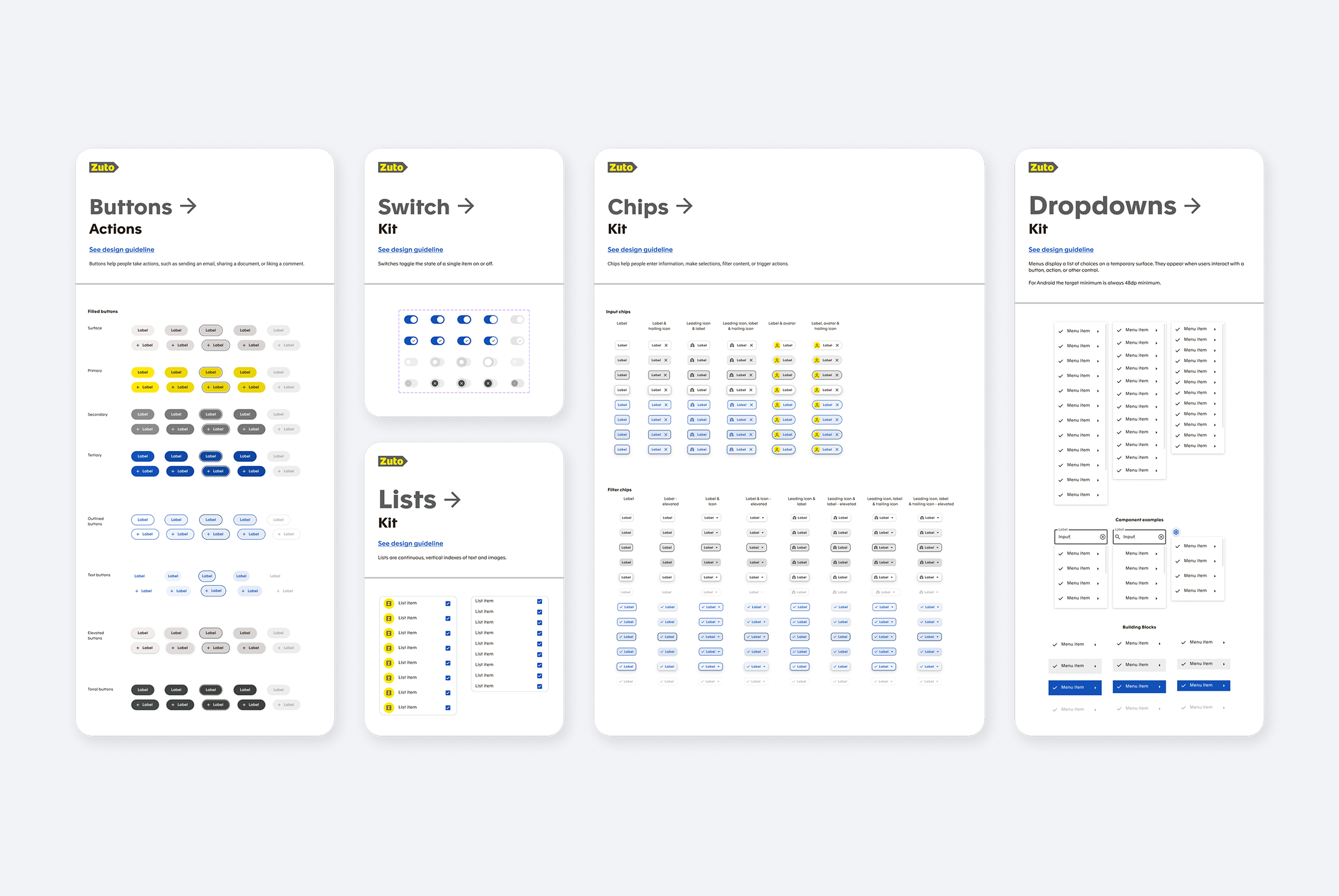
Zuto Design System
Refining the Experience
Validation
We tested the designs using high fidelity prototypes with both customers and internal teams. This was important because the platform needed to work for both sides. Users were asked to complete realistic tasks so we could see how easily they could move through the journey, while internal teams tested how well the product supported them when speaking to customers and managing the process. This gave us a clear view of what was working and where things still needed improvement.
Outcomes and Learnings
Testing showed that the new experience made things clearer and easier to follow, with users feeling more confident about what they were doing and what would happen next. Features like personalised recommendations and improved visibility in the dashboard were particularly well received. At the same time, we found areas that still needed work, such as giving users more freedom to explore before committing to actions and improving how certain features were explained. These learnings helped us refine the experience further and made sure the final outcome worked well for both customers and the teams supporting them.

